YOGI
•
YOGI •

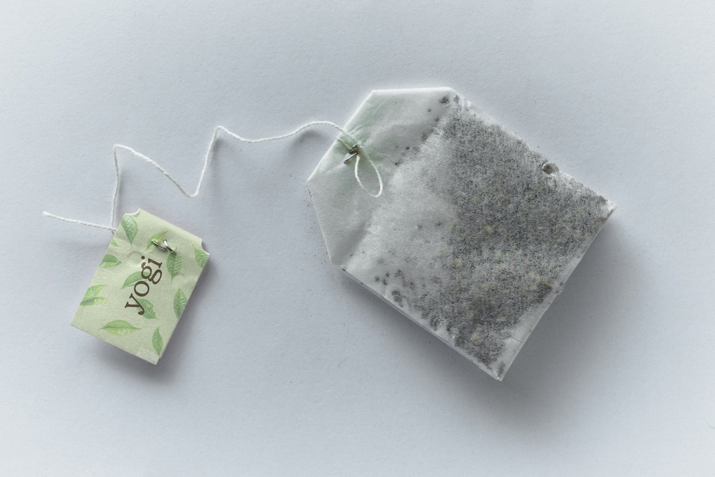
YOGI
re-branding and re-packaging for yogi tea.
Mission Statement
Yogi is a well-known brand of herbal and wellness teas. Founded in 1984, the company offers a wide range of organic tea blends crafted from over 120 spices and botanicals sourced from around the world. Yogi products are designed to support various aspects of health and well-being.
Target Audience
Yogi’s audience generally consists of health-conscious consumers, who are interested in natural and organic products, including herbal teas. These people are likely to be interested in fitness, yoga, a healthy lifestyle, may be looking for alternatives to caffeine-based beverages, or people who just love tea.
Branding Before
The packaging includes a henna design and is designed with a clean look, including a bright palette with strong photography. The logo uses a simple organic serif typeface, including a leaf behind the type.
Moodboard
This moodboard is inspired by the organic sustainable theme Yogi has, but with more of a natural illustrative style. I want to give Yogi a little makeover but still keep their brand noticeable.
Sketches
I sketched ideas based off the moodboard and my knowledge from researching about Yogi and their website.
Digital Drafts
I moved forward with three ideas and designed basic digital draft layouts. I wanted to involve the information from the before packaging but bring a different vibe to their brand.
Typography & Color Palette
The color palette is inspired from both the natural essence I aimed for and the tea flavors, Green Tea, Lavender, and Lemon. For typography, I selected two organic typefaces, one for the logo and another for key copy. To create contrast in the design, I paired these with a clean sans-serif for the remaining text.
Final Logo
I chose to use all lowercase typography to reflect the brand’s approachable and natural feel. To reinforce the connection to tea, I customized the letterforms in “Yogi” by shaping the bar of the “g” and the tail of the “y” to resemble leaves, evoking the essence of tea leaves and nature.
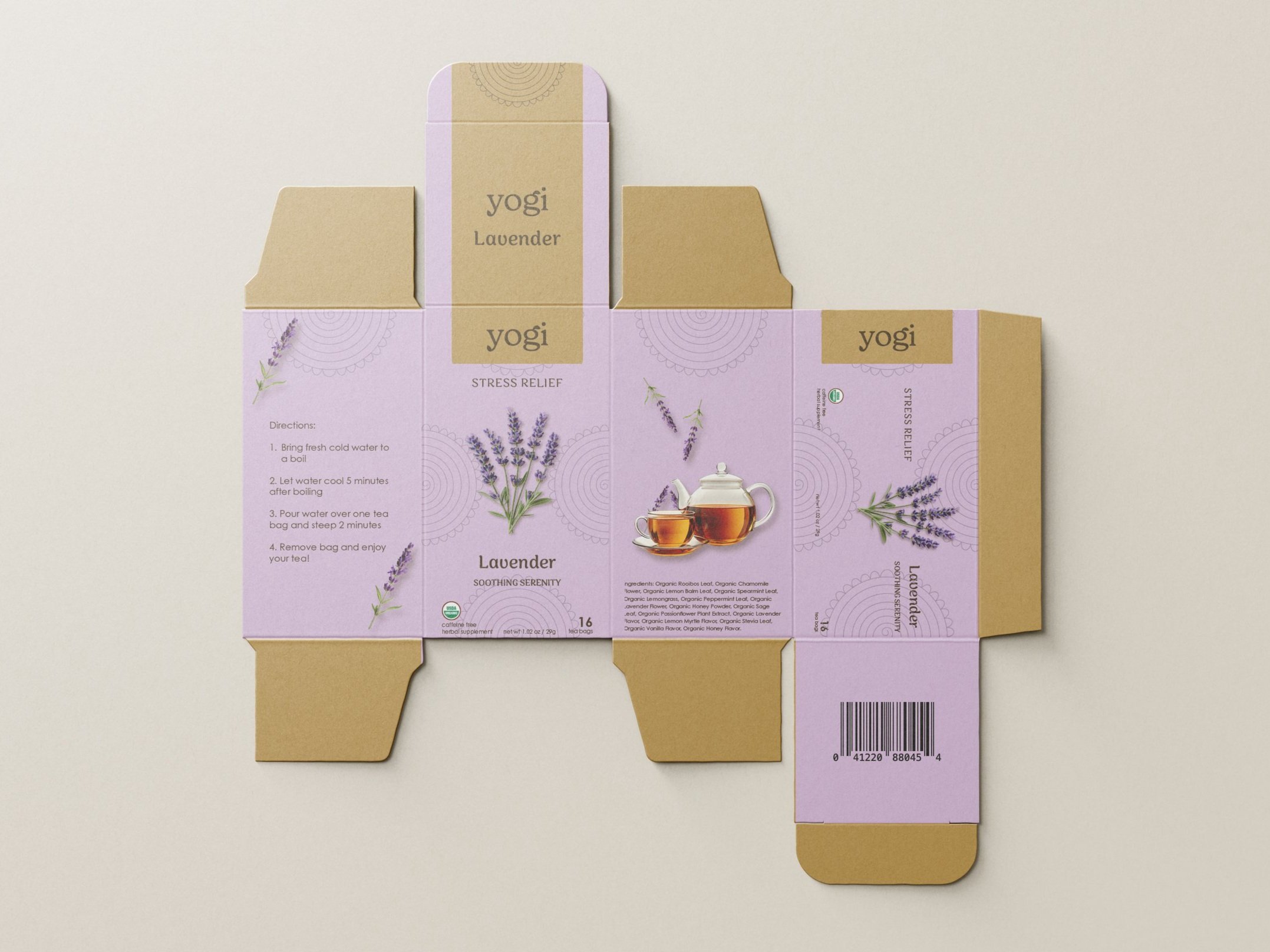
Final Packaging
The final front packaging features a clean, nature-inspired layout, highlighted by a cardboard-colored label, simple henna illustrations, and imagery of the key ingredients. Soft, flavor-specific colors were added to help the audience easily distinguish between each flavor.
Mockups
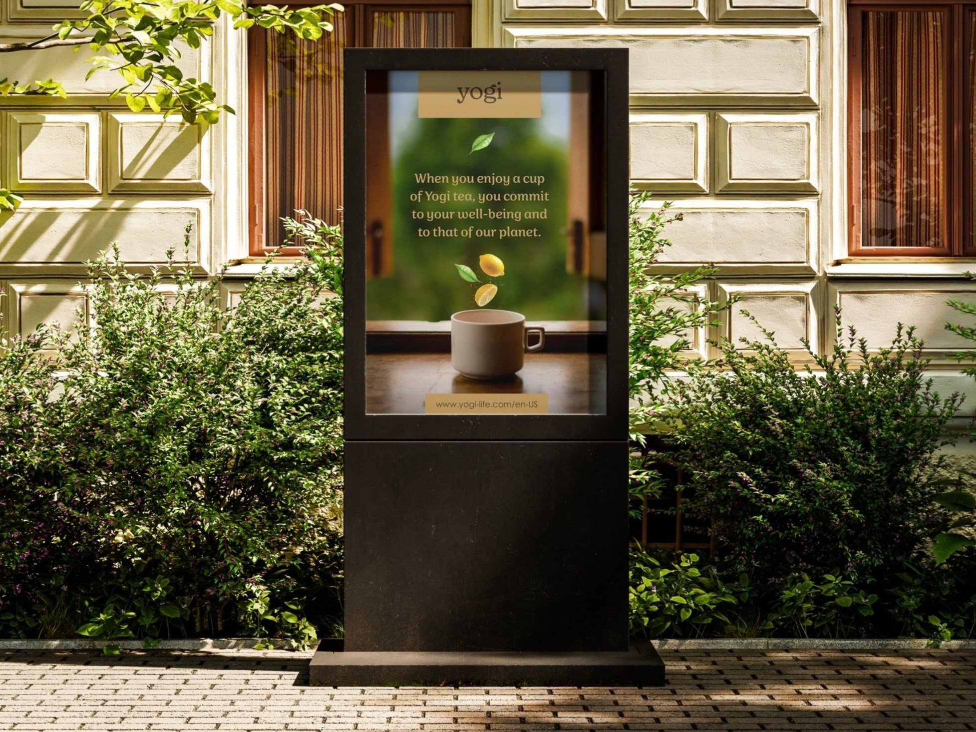
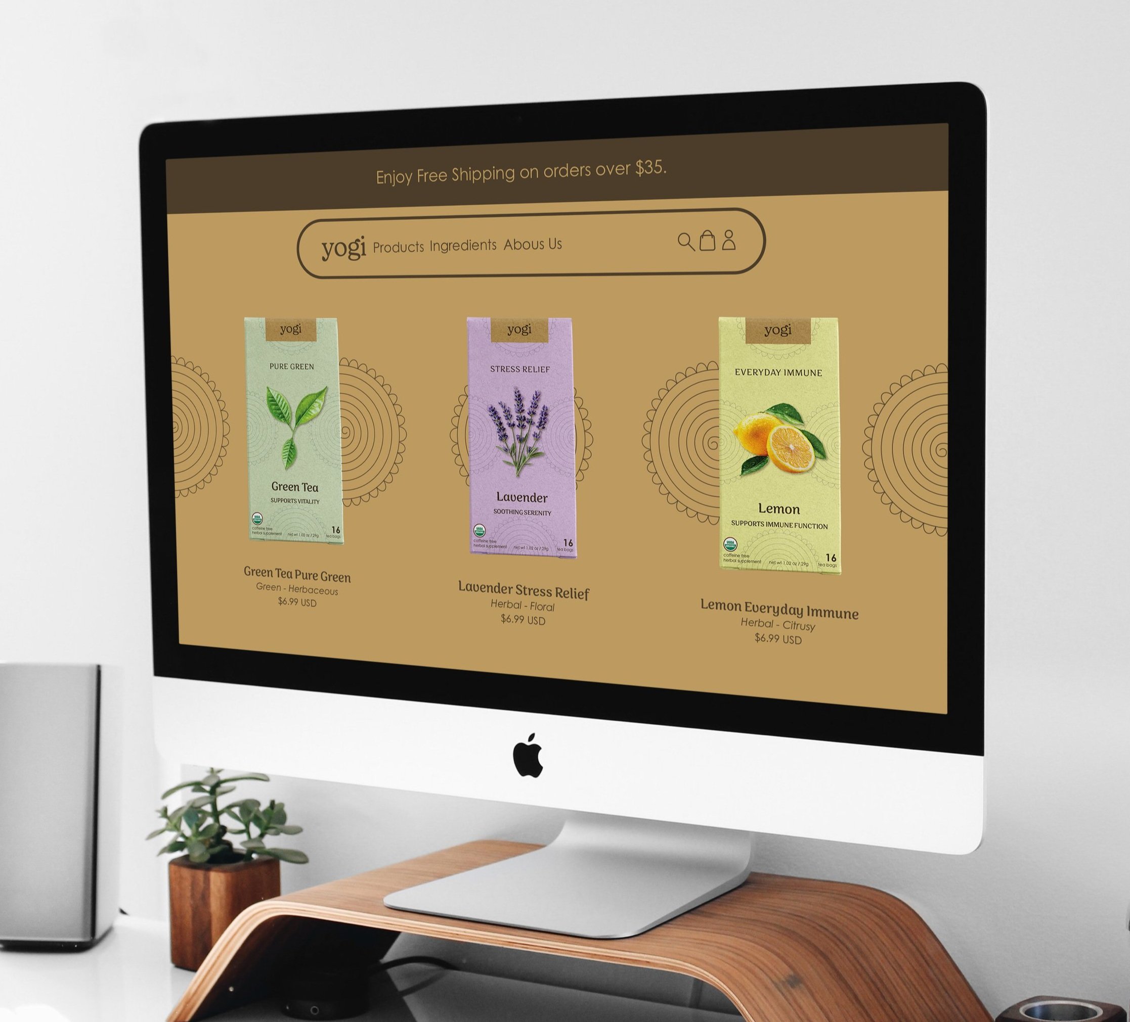
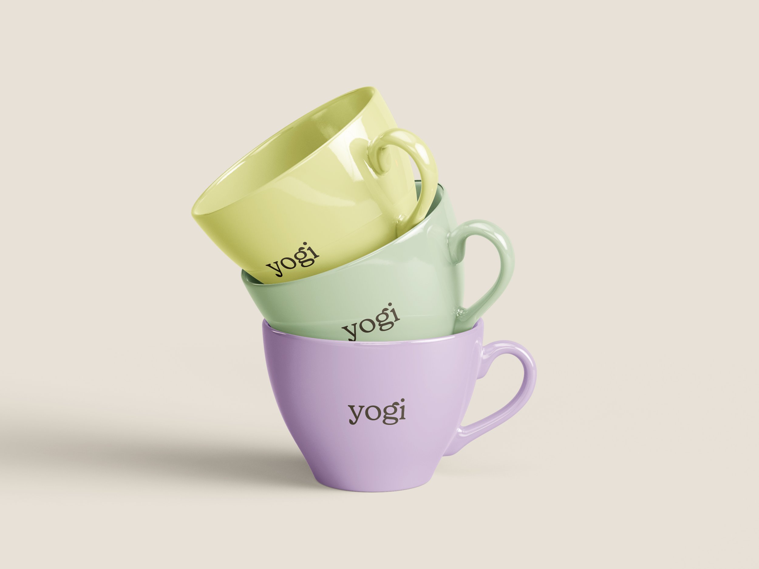
The mockups include the front packaging, a die-cut package, an outdoor advertisement, a website preview that highlights the tea selection experience, three branded mugs, and a custom tea bag tag.