TO DIE FOR
•
TO DIE FOR •

TO DIE FOR
branding for an all-year-round horror and halloween store.
Mission Statement
To Die For is an all-year-round horror and Halloween store based in Austin, offering a killer selection of masks, costumes, decorations, animatronics, and accessories, with a bold blend of spooky aesthetics and dark colors.
Target Audience
To Die For is for the people who wish it was Halloween every day. Whether they’re a die-hard horror fan, a Halloween lover, or just want to keep the spooky spirit alive all year. This group love dark aesthetics, bold looks, and that thrill of finding something weird and spooky.
Moodboard
This moodboard is inspired by iconic horror characters and spooky visuals, using a bold palette of black, blood red, and bone white.
Sketches
I sketched ideas based off the moodboard and my overall knowledge of horror and Halloween.
Digital Drafts
I moved forward with the idea of bloody type, handprints, and a knife. Also with the idea of gothic cemetery gates opening, with the spooky type inside the gates.
Typography & Color Palette
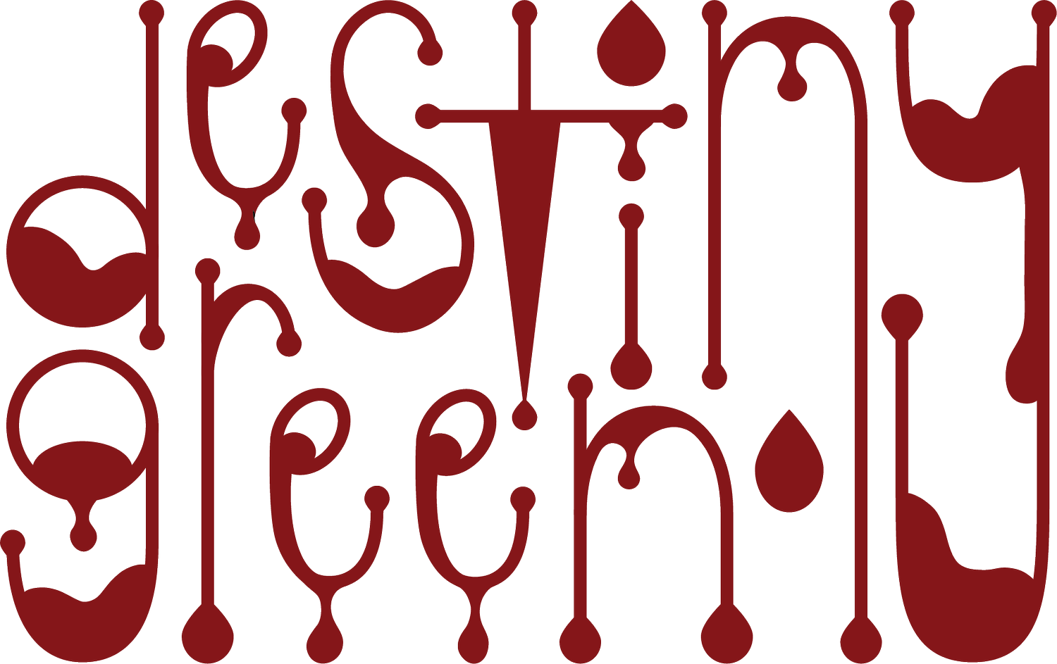
The bold color palette includes black, blood red, and bone white. For typography, I chose a sharp rough typeface for the logo, paired with a round clean typeface for the copy, to show contrast between the two.
Final Logo
I chose this rough stacked logo, replacing the “o” in For with a bloody handprint, that is shaped a little round to still give off the “o” shape. With two variations of colors, one with black and blood red, and the other with just blood red.
Mockups
The mockups include business cards, a loyalty card, the masks page displayed on a laptop, advertising signage, branded t-shirt merchandise, and a custom shopping bag.


