KANDI KAOS
•
KANDI KAOS •

KANDI KAOS
branding for a rave.
Mission Statement
Kandi Kaos is a rave full of color, energy, and kandi. This rave has crazy lights, loud electronic music, people jumping and head banging, and people trading kandi. The overall vibe is Y2K rave brat meets Lisa Frank on a sugar rush.
Target Audience
Kandi Kaos’s audience is generally young adults in their late teens and early twenties. This group are often drawn to the immersive music experience, the vibrant culture, and the opportunity for self-expression.
Moodboard
This moodboard is inspired by my knowledge of raves, research of other raves, and eye-catching visuals. It blends elements of stickers, beads, lights, illustrations, and a neon color palette.
Sketches
I sketched ideas based off the moodboard, the overall Y2K rave brat meets Lisa Franks on a sugar rush theme, and what I personally know about raves.
Digital Drafts
I chose a typeface that perfectly matched the playful, sticker-like, kandi-inspired aesthetic I was aiming for. The layout shows a bold, asymmetrical style to reflect the energetic and maximalist feel of the concept.
Typography & Color Palette
The color palette I chose is inspired by a neon rainbow aesthetic that captures the electric energy of the rave. For typography, I paired a bubbly, playful typeface for the event name with a digital, boxy font for the supporting text, creating a fun contrast.
Finals
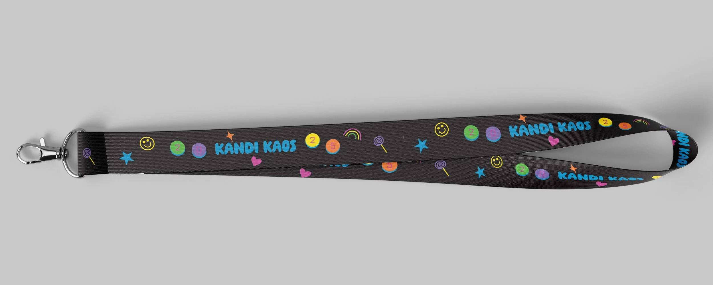
The final designs fully embrace the chaos with an explosion of neon elements like rainbows, hearts, stars, sparkles, lollipops, smiley faces, and kandi beads. Set against a black background to make the colors and typography pop.
Mockups
The mockups include a poster, a billboard, wristbands for attendees, a bandana designed to help protect against dust, a lanyard, perfect for hanging kandi, and a handheld fan.


